Rightio.
Well, graphics lies pretty close to my heart, and thus, makes me want to be all mushy and share my experience.
When I started out here in the VE, I was pretty much screwed up with graphics. Couldn’t do anything, nada. I remember, I was quite overwhelmed with everything the VE graphic members did, and I pretty much tried a lot to come near their skill level.
I’ve seen various members here trying their hand with it as well, and in the process make some small yet very basic mistakes that influence the quality of their work.
Everything, in this thread will be done using the Gimp program, a freeware tool that anyone can download. Here:
http://www.download.com/GIMP/3000-2192_4-10073935.htmlI myself, haven't really used Gimp, so this is a learning curve for me as well considering software. But I hope that with this thread you will be able to learn more about some basic design principals, because that really makes a difference.
Basic design principles includes some of the following:
- Composition
- Color
- Concept
- Quality
As I stumble upon more random thoughts concerning these principles, I'll mention them.
A designer’s success doesn’t depend on the flashy fancy program he uses, but most obviously his skill. The flashy program is just the cherry on the cake I believe.I’ve seen amazing things being done in MSpaint for example.
I will not be doing this tut in one go, but rather do it, week by week, day by day, give other fellow members to post their own set of hints and tips, or for others to ask questions. For the members who are posting their hints and tips, please take in mind that while you may have photoshop or Fireworks, it doesn’t mean everyone does, so keep your advice friendly, unless another member has a specific software related question.
So, what involves the process from going from this:
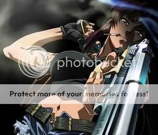
to this: ?

One of the most common problems I’ve encountered on this forum with images is the following:
 The problem here is the following:
- The font is blurry and just not easily readable.
- The image itself is scaled in wrong proportions, and just simply squashed.
All in all, it looks ugly and dysfunctional.
What most likely has happened here is either:- You applied font to the image while it was still in its original size.
- You then merged the layers or whatever before scaling it to 100x120
- After that, you noticed that your image didn’t fit in with the size limits of the Comnet, so you most likely brought down the quality as well.
This is how you could have approached the process:1.If you’re image is very wide, crop it a bit till the height is more dominant in size.
2.That means going from:

To this:

All with simple cropping. So now, the image is still big.
3.Next, size it down to the 100x120 dimensions.
4.Now you can add text without the risk of text going blurry.
5.Merge the layers, save it as GIF and this would be the end result:

Hi, now, it aint flashy, but lookie, the text looks alot better, though I'd say the composition and size definitely needs a bit of jazzing up.
Ah...you've noticed the grainy texture as well?
I exported the Gimp image to Gif. It doesn't have the same compression capability as JPEG, and somewhere along the line, you lose that tiny bit of image quality. That's why its important to beforehand pick an image
high quality. Take a look at the original image, you'll already notice it is grainy as well.
Of course, there most likely is a way around the grain issue, by fiddling around with your image modes and compression types, but for now, lets stick to the basics.
Thank you for reading this far.
ANyone is welcome to ask questions, post comments as well as post their own set of tips and hints what helps them, I will continiue to tackle this thread with new information regualry.
Until then,
Happy third of September

[This message has been edited by
Aeos
(edited September 3, 2008
2:09:27 PM)]
[This message has been edited by
Aeos
(edited September 3, 2008
3:22:40 PM)]